At 2014, PT Chemindo Interbuana, a chemical trading company based in Jakarta, hired us to rebrand their company. As a well-established company, they wanted a more fresh, sophisticated and modern look, leaving the old style they had before. The new look must also be in line with the new vision, mission and core values so that there is truly renewal from all sides of the company. Therefore, we work together to conduct surveys, interviews and research to get the latest insights from within and outside the company. The results of this process gave birth to a new vision, mission and core values which we then present in a new brand identity design.
VISION – To be leading chemical trading company in Indonesia.
MISSION – Provide valueable products, provide extra mile services, manage a caring relationship, building positive reputation, building competitive human resource, building strategy.
CHEMINDO INTERBUANA CORE VALUES
Chemistry
Maintaining a work culture based on the values of togetherness and kinship that has been formed and well-established among all parties and is one of CIB's strengths that can be managed to actualize its vision.
Costumer-centric
Oriented to the interests of customers and committed to providing the best service.
Confidence
Have confidence and build a sense of pride in being part of CIB which is implemented in a way of working with integrity and reliability.
Competitive
Dare to compete on a national and international scale and build a work culture that is professional, competitive and has added value based on healthy business principles.
Identity Exploration
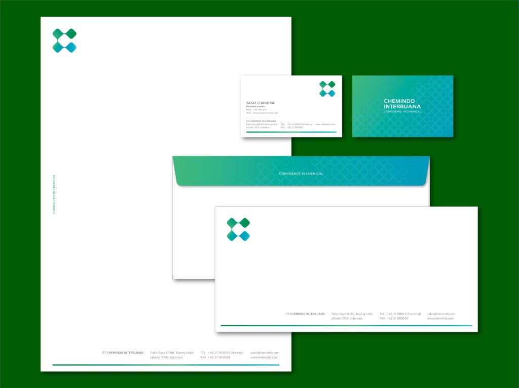
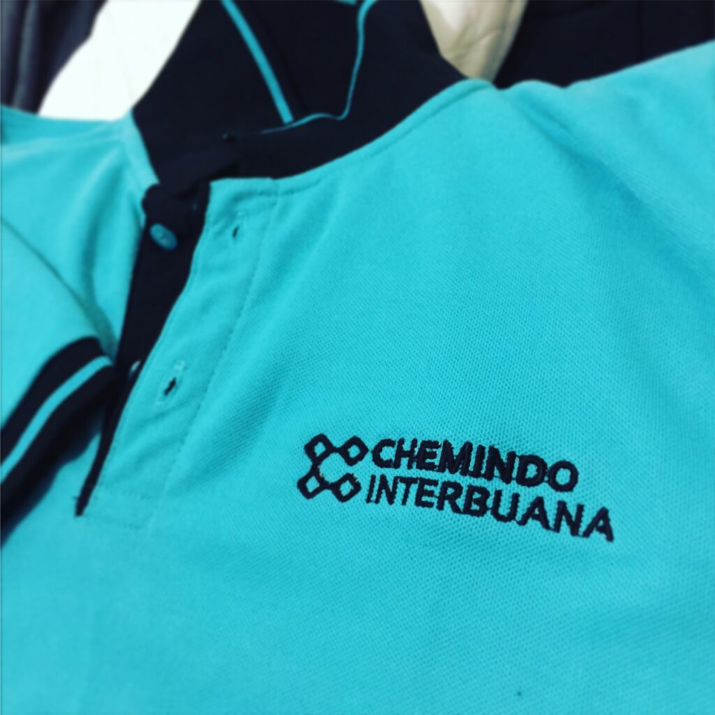
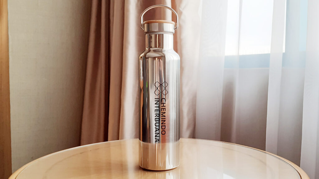
The visualization of the logo is inspired by the shape of the molecular bond, which is a common form in the chemical world. These shapes are combined to form the letter C, which is the initial letter of Chemindo. The four values mentioned above also begin with the letter C. Each shape in the visual supports one another to tell that each element in Chemindo is of the same mind and in line to move together to actualize its vision together. One end represents starting point and the other end represents finish line, symbolizing Chemindo’s movement to achieve the intended goal or vision.
The coloring is gradated from blue to green, to emphasize Chemindo’s transformation towards its vision of becoming a leader in the chemical industry. The blue color symbolizes trust, sincerity, stability, innovation and strategies that are continuously built to achieve these goals. The green color symbolizes growth and a sense of togetherness or we can say harmony that already owned by PT Chemindo Interbuana.