Creating a logo is not easy, because it requires a deep understanding of the brand that we will create an identity for. As a branding agency, we have to do a detail examination of the vision and mission of this brand the meaning of its name. We have to keep the existing meaning in line with the meaning of our identity.
The process for making this logo is quite long, about 7 months. We explore insights, look for comparisons with competitors, interview, build concepts, submit drafts, revise, explore new ideas and so on. It happened simultaneously until we finally create the final logo in gold, on top of a black background.
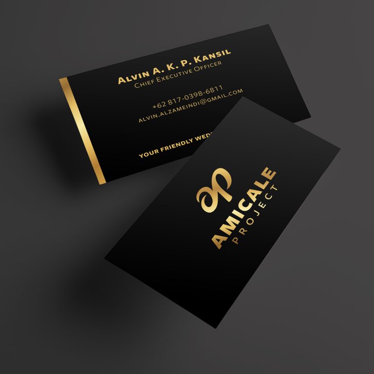
Amicale Project is a newly established wedding organizer and wedding planner in Jakarta. Amicale Project reflects a friendly impression when serving its clients. Amicale means friendly. The name Amicale Project itself can be shortened to AP, which also stands for the initials of the two owners. After going through some discussions and revisions, we finally decided to develop a logogram with the initials AP. The AP initials contain elements that symbolize infinity. This infinity symbol implies that Amicale’s love and fortune always flows infinitely for all stakeholders and clients they serve.
We hope that this identity will always be a reminder of the vision and mission for the entire Amicale Project team, and of course it have to be done in every scope of work of the Amicale Project.